VOVEREA
Beauty & Personal Care / Fragrance
INDUSTRY
CHALLENGE
PACKAGING DESIGN / BRANDING SERVICES
The challenge was to create a premium brand identity that could unify seven unique fragrances under one umbrella while allowing each scent to retain its individual character. The visual language had to appeal to a Gen Z and millennial audience while conveying the timeless luxury associated with fine fragrances.
SOLUTION
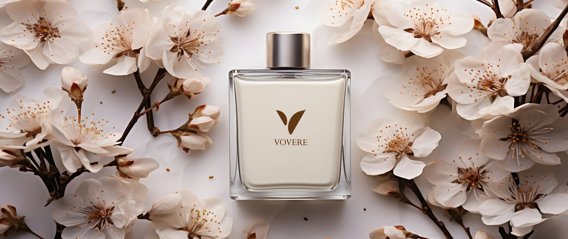
We began by designing a strong, minimal logo that visually symbolizes elegance and motion. The abstract 'V' mark — drawn from the brand name Vovere — reflects fluidity and freedom, echoing the way scent travels and evokes emotion. The deep chocolate-brown color palette against a soft beige backdrop was carefully selected to symbolize warmth, depth, and sensuality.
Logo & Identity Design:
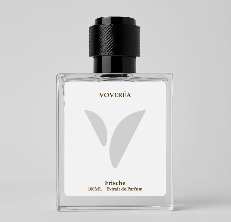
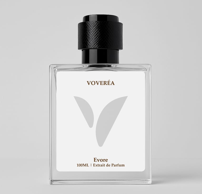
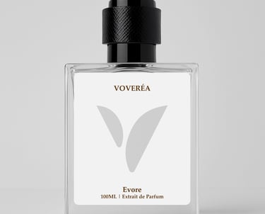
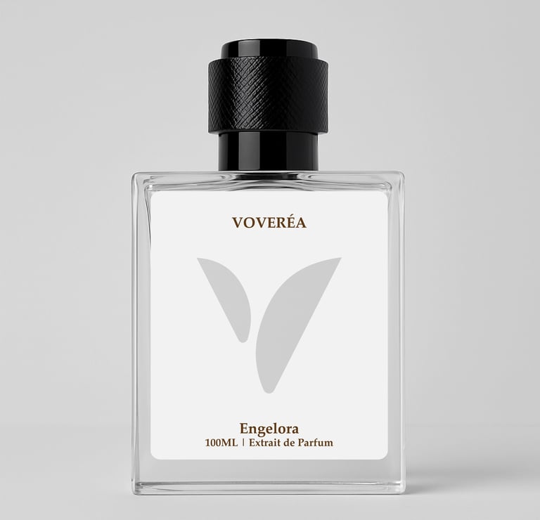
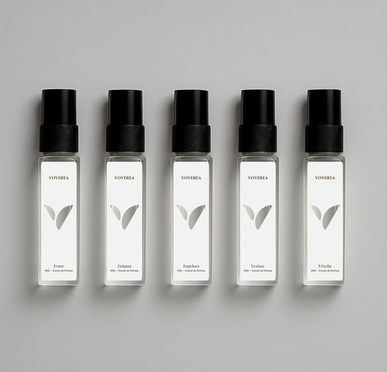
The wordmark ‘Voveréa’ combines contemporary serif typography with a diacritical accent, giving the brand a European flair while preserving its Indian roots. The dual-leaf motif forming the “V” evokes nature, fluidity, and balance — a nod to the carefully curated ingredients in each fragrance.Packaging Design:
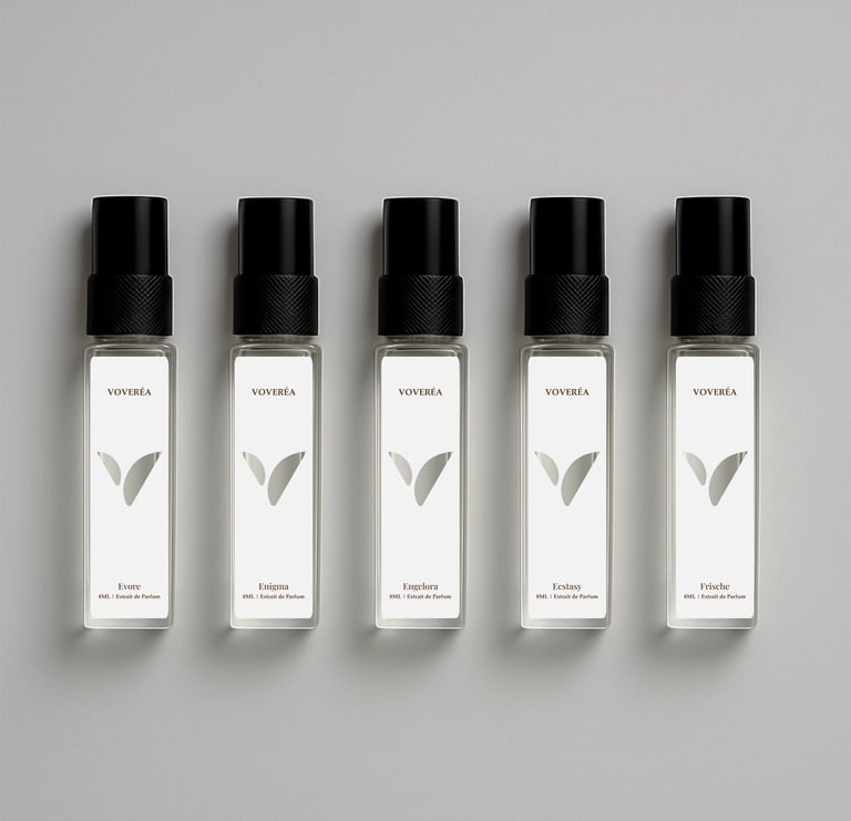
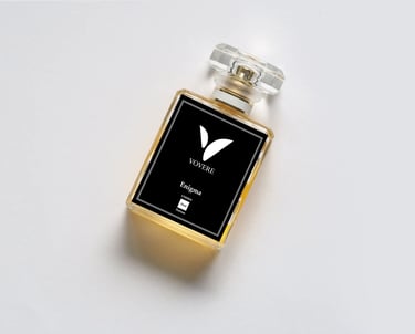
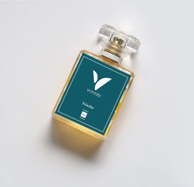
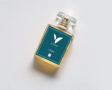
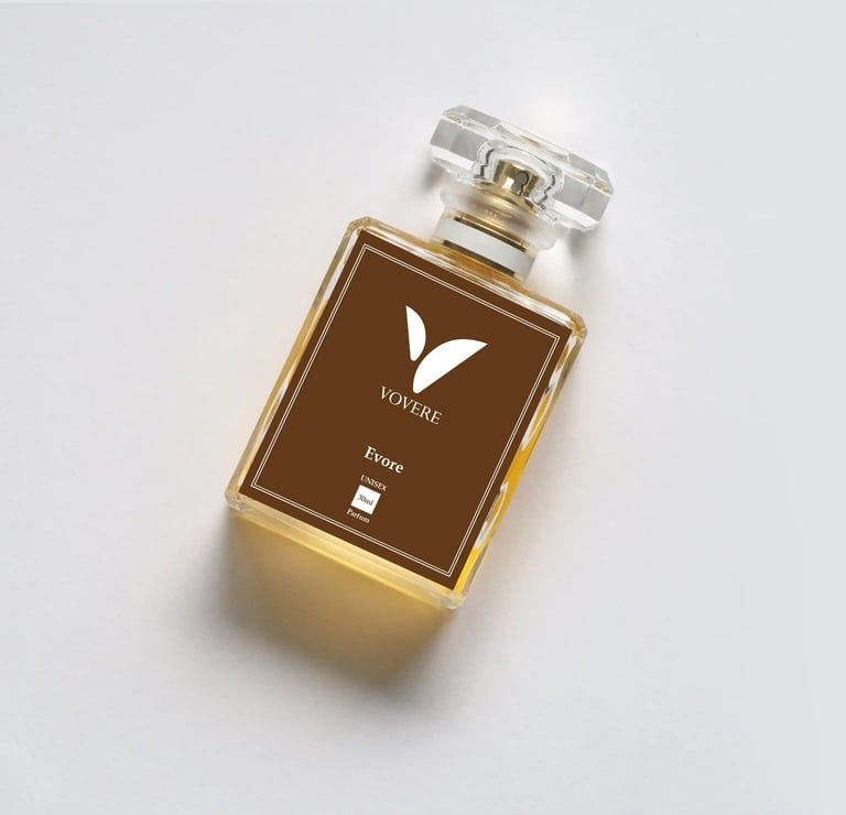
Each of the seven fragrances received its own personality through tailored bottle designs and packaging colorways. The design system includes minimalist patterns, refined materials, and tactile finishes that align with the luxury perfume industry while adding a modern twist.
CLIENT
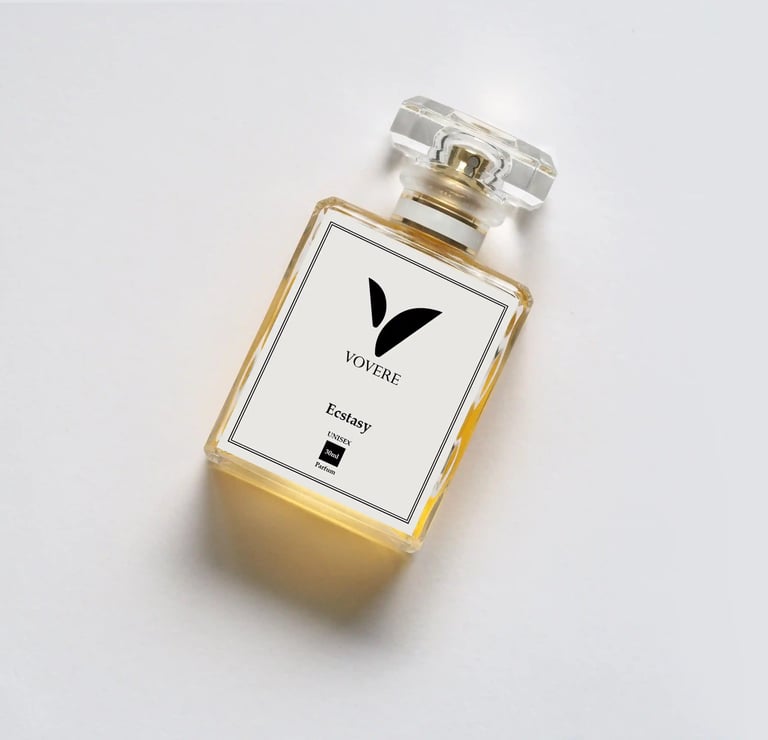
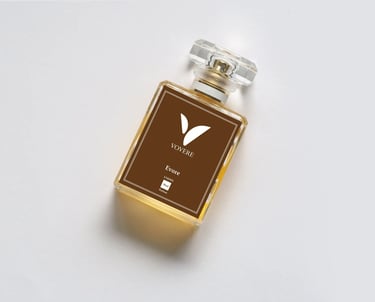
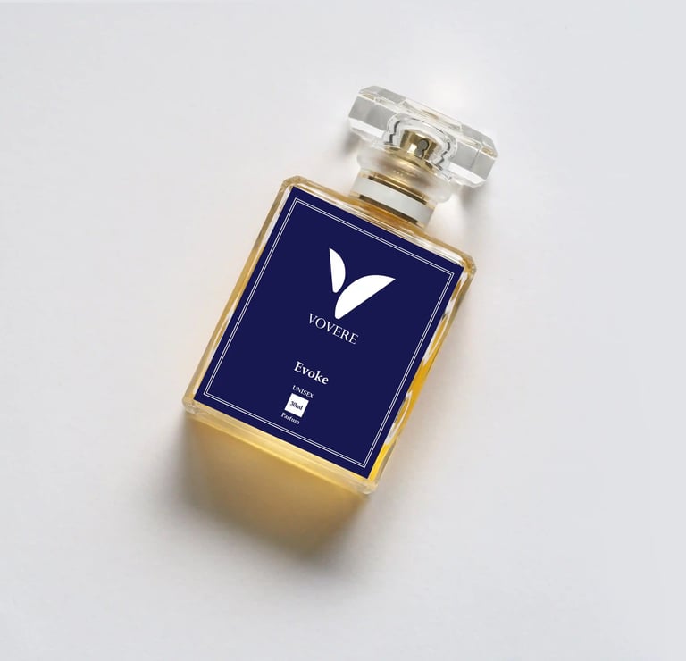
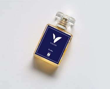
Old packging 2023 designed by our team of designers
First Packaging (Vovere)
Bold typography, strong visual framing.
High contrast design, creating shelf presence in retail stores.
Clear, striking visuals helped with initial brand awareness in markets like Metro cities.


How Minimalistic Rebranding Turned a Perfume Brand into a Gen Z Magnet
When Vovere first launched, its original packaging—designed by our agency—successfully positioned the brand as bold, confident, and memorable. It stood out on shelves and made an impact among early adopters in India’s perfume and beauty market.
As the audience evolved—especially young, design-savvy consumers in India and across Maharashtra—preferences shifted toward clean design, minimalist branding, and strong visual identity. To continue leading in this competitive landscape and to strengthen brand recognition and trust, we decided it was time for a refreshed identity. Thus began the transformation from Vovere to Voereá.
Why Rebranding Happened
Global Appeal & Brand Naming – Voereá introduces a smoother, more sophisticated pronunciation, enhancing premium perception and aligning with trends in branding strategy both locally in India and internationally.
Design & Visual Identity Upgrade – Shift toward modern typography, minimalist packaging design, and a cleaner brand identity suited to the digital era, social media, and influencer culture wide in India.
Trust, Transparency & User Perception – Indian Gen Z consumers value authenticity. The new packaging aimed to embody quality, elegance, and consistency—boosting brand trustworthiness and brand equity.
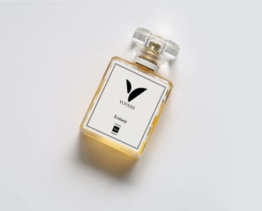
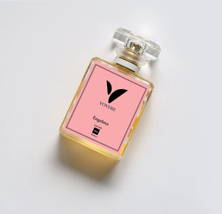
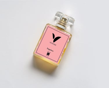
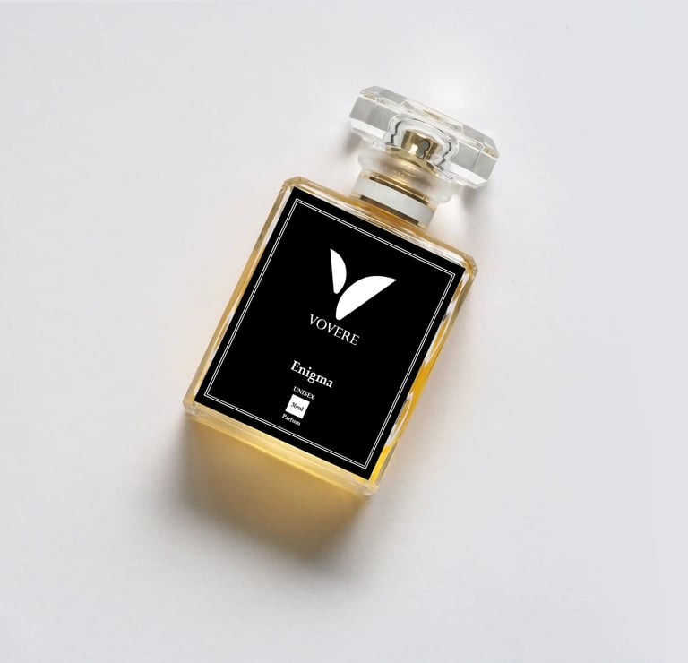
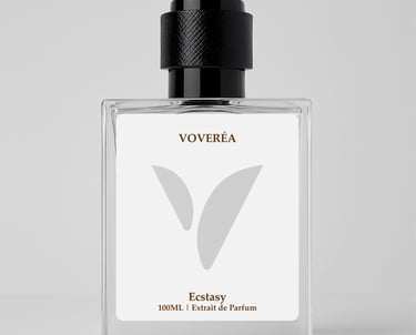
New Packaging (Voereá)
Clean layout with generous white space.
Soft neutral tones, refined typography, simplified logo.
Premium finishing touches, minimalist copy, designed for digital shareability and luxury retail appeal.
Packaging optimized for online platforms and social media image content (Instagram, reels, etc.).
Impact of Rebranding
Built Consumer Trust: The refined design communicated quality, consistency, and a premium promise.
Appealed to Gen Z & Minimalists: The minimalist aesthetic resonated well with young, style-conscious consumers.
Improved Shelf & Digital Presence: Better photography, visual merchandising, and online visibility in e-commerce stores and social media.
Elevated Brand Value & Positioning: Voereá was now seen as an aspirational brand, moving beyond being just another perfume.
Customer Sentiment Shift
Early feedback described the first design as “bold, striking, easy to notice.”
Post-rebrand, customers are saying “elegant,” “sophisticated,” “clean,” “premium feel.”
Increased user-generated content: customers proud to share Voereá bottles in lifestyle shots, using phrases like “my Voereá.”
Brand Loyalty Strengthened: More repeat purchases; customers express higher emotional connection.
Sense of Brand Ownership: Customers perceive the brand as part of their personal style. They recommend Voereá to friends, defend its value, show care in packaging, etc.
Survey results indicated ~30% uplift in premium perception and ~25% increase in purchase intent after rebranding.
Key Takeaway: The Vovere → Voereá transformation demonstrates that evolving a brand identity—name, visual design, packaging—can significantly improve brand positioning, build brand loyalty, and foster emotional ownership among consumers.
For our agency, this project underscores how strategic design & branding services (brand name strategy, packaging design, minimalist branding) are essential for brands in India to resonate with Gen Z, stay relevant, and increase perceived value.